You may not have considered it before, but symmetry in art can make or break a painting. But why is it so important? And how can you make it work for you?
To discover the answers, we need to go back through time and take a look at why symmetry is as vital today as it was our cave-dwelling ancestors.
What is Symmetry in Art?
Symmetry in art is when the elements of a painting or drawing balance each other out. This could be the objects themselves, but it can also relate to colors and other compositional techniques.

Why is Symmetry so Important to Us?
You may not realize it, but your brain is busy working behind the scenes to seek out symmetry when you look at a painting. There are several reasons for this. The first is that we’re hard-wired to look for it. Our ancient ancestors may not have had a name for it, but they knew that their own bodies were basically symmetrical, as were those of potential predators or prey. Therefore, this came in handy whether choosing a mate, catching dinner or avoiding being on the menu of a snarling, hungry pack of wolves or bears!
Take a look at your face in the mirror and imagine a line straight down the middle. You’ll see both sides of your face are pretty symmetrical. This is known as bilateral symmetry and it’s where both sides either side of this dividing line appear more or less the same.
The second reason why symmetry in art is such as big deal has to do with the way our brains process information. The tradition in the West is to read and write from left to right, but it’s the right-hand side of our brain that processes this information.
In 2011, researchers looked into how the directionality of our writing affects our depiction of depth in representational art. They discovered that the way we learn to read and write has a direct impact on what we find most aesthetically pleasing. The researchers also discovered that people who were right-handed preferred images with a ‘left bias’, while left-handed people preferred the right.

A Manga/Anime girl courtesy of Becky Sonicfan
Why do Manga Comics Read From Right to Left?
Most people know Manga (the Japanese word for ‘comic’) is read from right to left, but why is this? It’s because ancient Japanese was read from right to left and, even though people in Japan changed and started reading from the left centuries ago, this tradition has continued ever since in the pages of Manga. Why? Mainly because it makes things easier for the artists and because people who buy Manga have gotten used to reading this way. We just don’t think Manga would be the same if they changed it. How about you?
How to Use Symmetry in Your Own Art
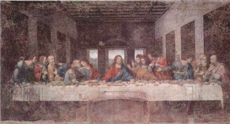
Probably the most famous example of symmetry in art is The Last Supper, by Leonardo Da Vinci. Every element of this painting is perfectly balanced and composed to draw to eye into the central figure of Jesus. See how the perspective lines of the walls converge towards him? Notice how the figures on the left are facing left too?
Here’s how you can use symmetry in art to your advantage when painting or drawing.
1. Spend Time Working on Your Composition
Before starting work on a painting or drawing, it’s worth devoting some time to your composition and the symmetry of the objects placed within it. What do you want the focal point to be? How should the elements of your painting relate to each other?
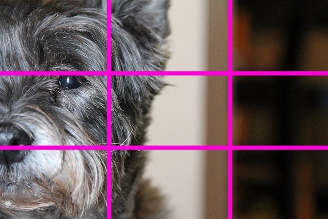
Start by producing some thumbnail sketches and working out which composition works best. Think about the golden ratio and the ‘rule of thirds’. To do this, divide a rectangle (the ‘frame’ of your painting) up into equal thirds horizontally and vertically. Not only have we found this technique to be super useful, it’s also saved us a whole load of work later trying to fix our mistakes.
Remember us saying earlier how symmetry in art can make or break a painting? It’s true! It doesn’t matter how detailed your brushwork is or how skilfully you’ve rendered the objects in your painting – if your composition doesn’t work as well as it could, it’ll always let you down. It’ll also be the first thing people notice!
Take a look at the pic of the cute pooch above. Is the focal point on the left? Check. Does the composition work well? Check. Note how when the image is divided up according to the rule of thirds, each element sits nicely within the divided sections. Try it on your next painting – it’s really simple to do and it could really work wonders for your composition.
2. Think About Symmetry With Your Light Source
Once you’ve worked out your composition and thought about the symmetry of the objects within it, you’re going to have to consider where your light source is coming from. Research has been done into which direction of lighting people respond to best and guess what? People generally prefer paintings lit from the left. Of course, this doesn’t mean you can’t have your light source coming from the right if you want to (and we’ve experimented with both), but you might just find your painting will work better in some cases if you have it coming from the left.
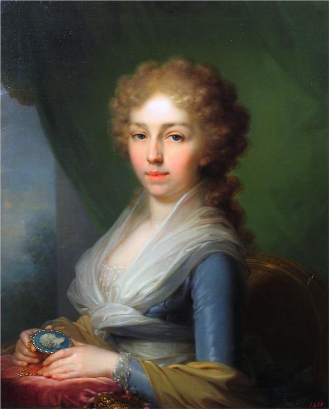
Portrait of Empress Elisabeth Alexeievna, by Vladimir Borovikovsky
3. Left-cheek Bias in Portraits
Now here’s an interesting one. Researchers looked at more than 1000 European portrait paintings produced from the 16th until the 20th century and were surprised at what they found. Almost 60 percent of the time, the subject had their left cheek turned towards the viewer.
Why is this? Some analysts think it’s all to do with our left-right preferences again and our instinctive love of symmetry in art. It’s not always the case though, and it looks as if social standing has some influence on whether it’s the left or the right cheek that’s facing the viewer. For example, academics such as scientists are often painted or photographed with their faces inclined to the right.
Why not try it out yourself? Get a friend to sit for you, and then experiment by having them turn their heads to give the left or right side more prominence. Which do you think works best?
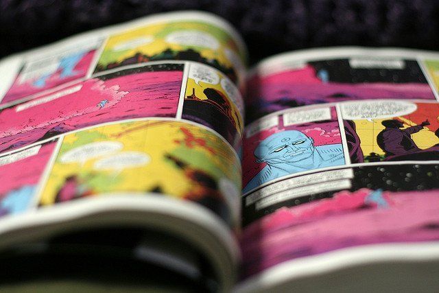
4. The Power of Symmetry in Graphic Novels
We’ve already seen how symmetry in art can be a powerful force, but it can also be used to suggest deeper meanings, such as in the Watchmen graphic novels written by Alan Moore and illustrated by Dave Gibbons. The central character of Rorschach wears a mask that features a symmetrical ink-blot pattern (the Rorschach test used by psychologists) and many of this famous book’s pages are arranged to be perfectly in balance with each other.
On pages 14-15 (the center spread) of Chapter V: Fearful Symmetry, each page is almost a mirror image of the other. Many people have looked into the possible significance of this, but there’s no doubt it helps create a visually-striking spread in a graphic novel. Why not do some experiments yourself? Run an imaginary line down your canvas (traditional or digital) and consider how the objects you’re painting will work if reflected on the other side. Who knows? This might throw up all kinds of creative possibilities and give you some pointers for your next project.
5. Symmetry and Color Balance
As well as balancing the elements in your painting, we’ve found it helps to consider balancing the colors you’re using too. Artists have employed this trick for centuries, with one of the most famous examples being during the feud which developed between the two British masters, John Constable and William Turner in 1832.
The story? Both these guys were huge in the 19th century and a certain amount of rivalry had developed between them. Therefore, when their paintings were shown alongside each other at the Royal Academy’s summer exhibition, each artist was keen to upstage the other…..
Constable had been working on his elaborate painting of London’ Waterloo Bridge for 10 years and the artists were allowed to continue adding to their work right up until the exhibition opened.
Having noticed how Constable continued to add rich layers of translucent color to his lavish landscape, Turner decided he needed to do something about his seascape, Helvoetsluys, in order to make it stand out.
His decision was simple yet highly effective. Walking up to his canvas, he confidently added a red buoy slightly off-center and stood back, knowing his work here was done. The effect of this small gesture was huge, prompting his rival to exclaim: ‘He has been in here and fired a gun’.
How can you achieve similar power in your composition? Think about the colors you’re using and try to balance them out across the canvas. If you’ve used blue in one section, try adding some of this same color to other parts of your painting. Then, when you feel you’ve got the symmetry right, think about the focal point and how you can really make this pop. Perhaps adding a small amount of a bright, saturated color you haven’t used elsewhere will do the trick?
Thankfully, learning about composition and symmetry in art isn’t difficult. It just takes practice – lots of it. The more you sketch and paint, the more you’ll develop an intuitive understanding of how it works. Why not try it out today and let us know how you get on?
Great article for entry level understanding into symmetry. As someone who’s diving more into a deeper understanding of art i was taught 3 things from this video that should have a everlasting effect on the way i handle art. Thank you!
Thank you so much! This is very helpful on my part as a teacher and student at the same time..