
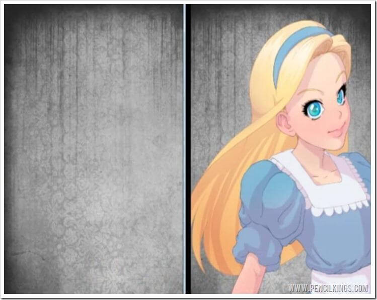
Here’s a preview of how the finished painting will look in this series on how to paint Alice in Wonderland:
How to paint Alice in Wonderland: Adding a Background

Ready to learn more about how to paint Alice in Wonderland?
Now that you’ve layed in areas of flat color, shadows and highlights, it’s time to add a background layer to your painting.
In this video, Sycra has used one supplied by his editor, but you can choose from any image you like – there are some great free Photoshop backgrounds available online.
To start with, take the Lineart and Color layers and merge them so they become one. Then, simply drag and drop your chosen background image onto the background layer.
Press Ctrl + T to scale your background image and feel free to move it around until you’ve got it looking how you want.
Next, duplicate the Lineart layer and turn off the old one. This will enable you to work on this new Lineart layer without affecting your earlier work.
Now, it’s time for one last look at your painting to see whether there’s anything you’d like to change.

Give Your Painting the Warp Factor
Now, here’s where things could get real tricky with learning how to paint Alice in Wonderland if you were using traditional media.
Sycra has taken a look as his painting and decided that Alice looks more like a 17-year-old than a seven-year-old!
If you were using paints, this would mean a whole lot of extra work and would be a real ‘facepalm’ moment!
Thankfully, there’s no need to get frustrated when learning how to paint Alice in Wonderland with Photoshop – you can change the look of Alice completely by using the handy Transform features!
So, if you find yourself in a similar situation to Sycra, hit Ctrl + T to bring up your Transform options, and then right click and go to Distort.
Then, simply distort your image until you’re happy with it. Remember, you’ve still got your original Lineart layer to refer to if you’re unsure. Making Alice’s head bigger will instantly make her look younger, so this is a quick and easy way to achieve this.
This is also a good time to reposition your image on the canvas to get the best possible composition – Sycra decides to move his new Lineart layer slightly to the left so it fits the canvas nicely.
After you’ve distorted your image, you might find that Alice’s body looks a little odd. You can easily fix this by hitting Ctrl + T again, followed by a right click and then Warp.
This will enable you to drag the image out from all sides until you end up with everything a little more in proportion.
Warping your image is not something you’ll have to do with every painting you create, but it’s a quick fix if you need one!
Once you’re done, apply the transformation and save your document as a different version. We’ve said it before, but we’ll say it again – always remember to save your files!
We’ve all been in that horrible situation where your computer crashes and you lose your valuable work – we don’t want you to suffer like we did!
Get Poised for Painting
After saving the day with Photoshop’s awesome Transform tool, it’s time to move on to some serious painting!
First of all, flip your image horizontally to check that everything’s looking good.
It is? Awesome! If not, make whatever final changes you want using the Transform tool again.
Here, Sycra has decided Alice’s elbow is a little too close to the edge of the canvas (remember the tangent we talked about in the previous series?) so he decides to adjust this before moving on.
Before you start painting, make sure you’ve got your reference pictures open and visible – you’ll need these to refer to when mixing your colors.


Adding Value to Your Painting
No, we don’t mean your painting will sell for mega bucks..yet! What we’re referring to are the color values in a painting – the different areas that will really help bring your picture to life and will look good even when viewed in black and white.
So, to see how these will affect your painting, create a new Adjustment Layer by selecting the symbol that looks a little like a Yin Yang icon at the bottom of your Layers palette.
Once you’ve done this, select Black & White from the options and you’ll see that your painting now appears in mono or grayscale, but you can still compare it to the color layer beneath.
Do the same thing on your reference photo and you’ll see what Sycra means about color values – notice how areas such as the cheek, nose and forehead are clearly defined as forms? You can see the turn of each of these and this helps them to stand out as 3D objects.
On our painting, this information isn’t there yet. For example, you can see where Alice’s nose is, but you can’t see what shape this is.
So, too add this information, we’re going to create many different areas of color when we paint to give a similar sense of form to the one in your reference photo.
Getting Busy With the Brushes
Get your brushes at the ready because it’s time to start painting! First of all, select your brush by right-clicking to bring up your Brushes menu – you can also access these options by pressing the button on your tablet pen.
Then, select a hard round brush (or a soft brush with the softness turned down) and adjust the size until you’re happy with it.
For this stage, Sycra’s using a large brush size of at least 300 pixels, but this will be changed according to which area of the painting he’s working on.
Once you’ve selected your brush size, go into your Brushes menu (next tab along on your Layers palette) and make some final adjustments to the tools of your trade.

Click Brush Tip Shape and make sure your spacing is down to around seven per cent. Then, check your Shape Dynamics and Other Dynamics and make sure these are all set to Pen Pressure.
Next, in your top menu bar, adjust the Flow of your brush to around 27 per cent. It doesn’t have to be this exact number (it could be 20 or 30 per cent) but Sycra likes this number so he’s sticking with it!
You can also adjust the Opacity at this stage – if you’re a beginner, you might find it easier to use a lower opacity to start with and work your way up.

Take a Closer Look at the Color Window
Now that all our brushes are set, it’s time to take a closer look at the Color Window, which you can access via the top menu bar (go to Window > Color) or simply by hitting F6.
Once your Color Window is open, you’ll see there are various different options. We’re going to be using the RGB sliders to mix our colors, which is a form of color mixing known as ‘additive’ color.
Put simply, you have black at one end of the scale and white at the other and you can obtain all the various colors and shades in between by adding some of any of these three colors.
If this seems a little complex at first, don’t sweat it – pretty soon, you’ll get the hang of it and will be able to create just about any color you can imagine!
In the next lesson on how to paint Alice in Wonderland, you’ll learn more about mixing colors using the RGB sliders and how you can then use this knowledge to work on your fully-rendered digital painting of Alice.
Return to the Stylized Painting Lessons Page